
Web App Onboarding: Best Practices and Strategies for 2026
Discover best practices for web app onboarding in 2026. Learn strategies to enhance user experience and reduce churn effectively.

Web App Onboarding: Best Practices and Strategies for 2026
What is web app onboarding and why does it matter?
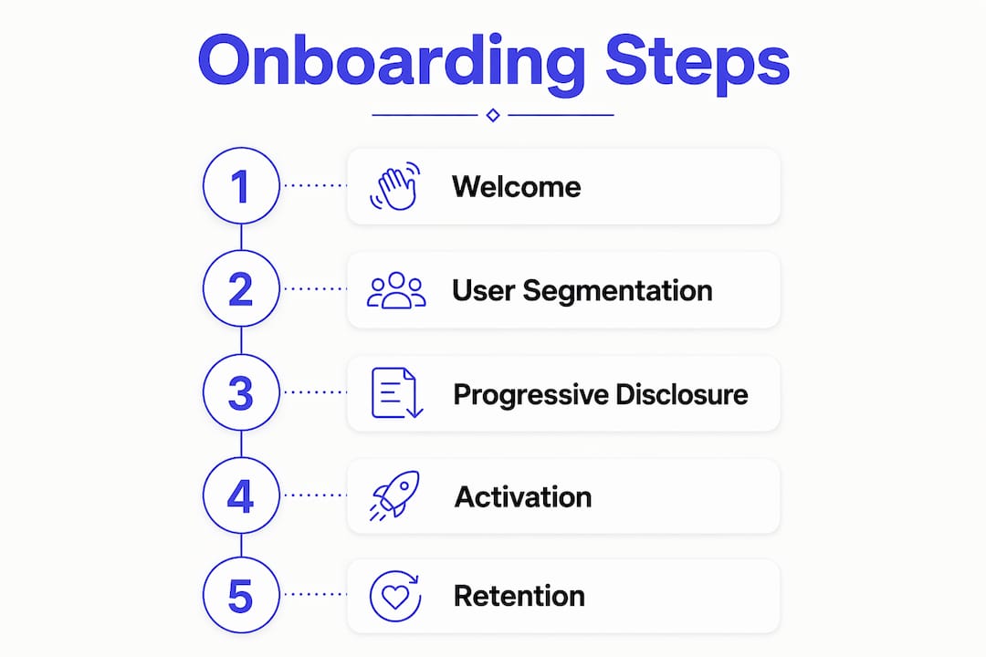
Web app onboarding is the end-to-end journey that takes a new user from signup to their first meaningful product experience, what designers call the “aha moment.” It is not a welcome screen or a product tour. It spans every touchpoint: signup flow, initial setup, in-app tooltips, checklists, and lifecycle emails, all working together to get users to value before they lose interest.
The stakes are high. Many users abandon an app within a few days, usually because they never reached the moment the product became useful. Effective onboarding is the single lever that changes that number.
The core elements of a complete onboarding flow include:
- Signup flow: Minimal friction, social sign-on options, only the fields you actually need
- Initial setup: Configuration steps that unlock the product’s core value
- In-app guidance: Tooltips, modals, and contextual hints triggered by user behavior
- Checklists and progress indicators: Visual cues that pull users through activation steps
- Lifecycle emails: Behavior-triggered messages that re-engage users who dropped off
- The aha moment: The specific action where the user first feels the product’s value
Good onboarding is not about showing every feature. It is about reaching that one clear win as fast as possible, then building from there.

Key principles that make web app onboarding work
The onboarding journey is not a feature tour. It is a path to a user outcome. Teams that confuse the two build flows that explain the product instead of delivering value. Here are the principles that separate effective onboarding from the kind users skip:
- Accelerate time-to-value above everything else. The fastest onboarding delivers the first win in under a minute. Every extra step is a place to lose people. Notion does this by dropping new users directly into a template workspace, so the product’s value is visible before any configuration is required.
- Always let users skip. A real share of users prefer to explore on their own. Forcing a linear tour creates friction. Trip.com puts a skip option in the top corner of every onboarding screen, getting confident users into the product immediately.
- Frame everything around what users can do, not what the product offers. “Set up your first project” lands differently than “Explore the project management module.” One is about the user; the other is about the product.
- Use progressive disclosure. Revealing features progressively rather than front-loading information keeps the first session short while still helping users go deeper over time. TikTok’s onboarding shows the feed immediately and introduces creator tools only after the user has spent time watching.
- Minimize cognitive load. Fewer choices, shorter forms, and contextual guidance reduce the mental effort required to reach value. Figma’s onboarding asks one question upfront (“What are you here to do?”) and routes users accordingly.
- Design for retention, not just activation. The aha moment is the start, not the finish. Kontentino, a social media scheduling tool, follows up its initial setup with behavioral email triggers that guide users toward their first published post, reinforcing the habit after the first session.
- Measure activation, not just completion. Completion rates tell you how many users finished the tour. Activation rates tell you how many users did the thing that predicts they will stay.
How to build an effective onboarding flow step by step
Building a good flow starts before you design a single screen. Here is a practical framework:
- Define your activation metric first. What specific action predicts that a user will stick around? For Monday, it is creating a first board and inviting a teammate. For YNAB, it is linking a bank account and categorizing one transaction. Identify that action and make it the anchor for every design decision.
- Design a minimal signup. Ask only for what you need to reach first value. Every required field before the first win is a reason to leave. Offer social sign-on where possible.
- Map your user segments. Different users have different goals. Bumble’s onboarding asks whether you are looking for dating, friendship, or networking, then routes each group to a different setup flow. That single question removes irrelevance for every segment.
- Build toward the aha moment, not around the feature list. Every step in the flow should answer one question: does this move the user closer to their first meaningful outcome? If it does not, cut it or defer it.
- Add contextual guidance, not a mandatory tour. Tooltips and hints that appear when a user hovers over or interacts with a feature teach more effectively than a forced walkthrough. Figma uses this pattern throughout its editor.
- Use checklists and progress bars. Checklists and progress indicators help users visualize completion, pulling them through activation steps. Keep the list short and ordered by value, not by internal product architecture.
- Layer in lifecycle emails. Users get distracted. A behavior-triggered email that says “You are one step away from your first published post” outperforms any generic “come back” message.
- Run structured A/B tests. Activation metrics and continuous iteration through structured testing are what separate onboarding that improves from onboarding that stagnates. Test one variable at a time: the welcome screen copy, the number of checklist steps, the timing of the first tooltip.
Best practices to boost retention through better onboarding
Retention starts at the first session. These are the tactics that move the needle:
- Give users a quick win with a tailored experience. Personalized welcome screens for each user persona, pre-populated with the features most relevant to their goal, reduce time-to-value and signal that the product understands them. Acorns does this by asking about financial goals during signup and immediately showing a projected savings chart based on the user’s answers.
- Use a combination of in-app messages. Modals for welcome, tooltips for feature discovery, embedded video for complex workflows, and checklists for activation steps each serve a different moment in the journey. No single format covers all of them.
- Apply psychology to reduce cognitive effort. Progress bars trigger the endowed progress effect: users who can see themselves finishing are more likely to complete the flow. VSCO uses a clean visual progress indicator during its initial profile setup that makes the process feel short even when it involves several steps.
- Let users skip and return. Forcing completion creates friction. YNAB lets users skip its budget setup and return to it later from a persistent checklist, which keeps the door open for users who are not ready to commit on day one.
- Reduce sign-up friction before optimizing the flow. Offer single sign-on, ask for only the data you need upfront, and defer optional configuration. Every required field before the first win is a potential exit.
- Build accessibility into the flow from the start. Sufficient color contrast, keyboard navigation, screen reader compatibility, and clear error messages are not optional extras. They are the baseline for any web app that wants to serve a broad audience.
- Trigger lifecycle emails by behavior, not by time. An email triggered by an incomplete checklist step outperforms a generic day-three nudge. Tie every message to a specific user action or inaction.
How web and mobile app onboarding differ
Web and mobile onboarding share the same goal but operate under very different constraints. Understanding those differences prevents teams from copying a mobile flow onto a desktop product and wondering why it underperforms.

Web apps and mobile apps approach onboarding differently because screen real estate, input methods, and user context are fundamentally different on each platform.
Key differences:
- Screen space: Web apps have room for multi-step wizards, side panels, and configuration-heavy setup flows. Mobile requires concise, thumb-friendly guidance with minimal text per screen.
- User context: Mobile users are often on the go, surrounded by distractions, and unlikely to complete a long setup. Web users are typically at a desk, with more time and focus available for structured onboarding.
- Input methods: Mouse and keyboard on web allow for richer interactions, hover states, and tooltips. Mobile relies on tap, swipe, and gestures, which changes how guidance is delivered.
- Interruption tolerance: Mobile onboarding must be shorter and more engaging because the risk of interruption is higher. Web onboarding can support deeper setup flows while staying focused.
- Platform consistency: Mobile apps behave differently on iOS versus Android, which affects onboarding patterns. Web apps have a responsive design that works consistently across operating systems.
- Progress indicators: Both platforms benefit from progress bars and checklists, but web apps can display more complex multi-step indicators without overwhelming the interface.
- Collaborative setup: Web apps, particularly B2B tools, often guide users toward inviting teammates or configuring shared spaces during onboarding. That kind of collaborative setup is rare in mobile-first flows.
The practical takeaway: if mobile drives quick activation, the web should drive structured setup. Design each experience around the context users are actually in.
How Revolarpz applies progressive disclosure and brand consistency
Revolarpz’s LARPZ app is a useful case study in onboarding for entertainment software. LARPZ is a fake banking web app where users customize balances, transactions, cards, and portfolios to create convincing banking screens for content, pranks, and lifestyle videos. The product runs as a progressive web app (PWA) on both phone and desktop, with access sold by license via crypto checkout.
The challenge for LARPZ’s onboarding is specific: the product’s value is visual and immediate, but the customization options are deep. Front-loading all of that complexity would kill the first impression. Progressive disclosure solves this by showing only the core customization tools first, then surfacing advanced features like portfolio editing and transaction history as users engage with specific modules.
Brand consistency during onboarding is equally critical for a product like LARPZ, where the UI aesthetic is the product. Generic onboarding modals that break the sleek dark-and-electric-blue design language would undermine the very trust the product is trying to build. Every tooltip, checklist, and welcome screen needs to match the brand’s visual identity.
On the technical side, headless onboarding libraries decouple onboarding logic from UI rendering, letting LARPZ maintain its custom brand appearance without being constrained by restrictive overlay templates. Combined with onboarding state persistence via local storage, users who close the app mid-setup can return and pick up exactly where they left off, preserving the premium feel of the experience.
Best practices drawn from the LARPZ approach:
- Match every onboarding UI element to the product’s visual identity, not a generic modal template
- Use progressive disclosure to keep the initial experience clean and introduce complexity on demand
- Persist onboarding state client-side so interruptions do not fragment the first-run experience
- Trigger guidance contextually based on user interaction, not on a forced linear tour
- Separate essential setup from optional customization and surface the optional steps only after first value is delivered
Pro Tip: Instead of building a mandatory product tour, use behavioral triggers to deliver contextual tooltips the moment a user interacts with a specific feature. This reduces tour fatigue and delivers guidance exactly when it is relevant.
How user segmentation and personalization change onboarding outcomes
Segmented and personalized onboarding paths reduce irrelevance and increase engagement by routing users according to their goals or profiles. A single generic flow forces every user through steps that may have nothing to do with why they signed up.
The most effective segmentation happens at the welcome screen. A short question about the user’s role or goal routes them into a tailored flow without adding friction. Figma asks whether you are a designer, developer, or product manager, then customizes the initial template suggestions accordingly. Monday asks what kind of work you manage and pre-builds a board that matches the answer.
Personalization extends beyond the first screen. Behavioral data collected during the first session, which features a user clicks, which steps they skip, how long they spend on each screen, feeds back into the flow to surface the most relevant next action. This is where lifecycle emails earn their keep: a message triggered by a specific incomplete step is far more effective than a generic day-three nudge.
For B2B products with multiple user roles, segmentation also means differentiating between a new user joining an existing account and a new account being set up from scratch. The first user needs full onboarding; the second needs only to get up to speed on existing account activity.
Real onboarding flows worth studying
The best way to build a better flow is to study what works in the wild. Here are examples worth examining closely:
Notion drops new users into a pre-built workspace template immediately after signup. The product’s value, organized, flexible documentation, is visible before any configuration is required. Users can start editing right away, and the aha moment arrives within the first minute.
Acorns personalizes its onboarding by asking about financial goals during signup, then immediately shows a projected savings chart based on the user’s answers. The value is concrete and personal before the user has invested any real effort.
VSCO uses a clean visual progress indicator during profile setup that makes a multi-step process feel short. The aesthetic of the onboarding matches the product’s creative identity, which reinforces the brand promise before the user has taken a single photo.
TikTok shows the content feed immediately, before asking users to create an account. The aha moment, discovering entertaining content, happens before any commitment is required. Account creation is deferred until the user has already experienced value.
Bumble routes users into one of three distinct flows based on their stated goal: dating, friendship, or networking. Each flow surfaces different features and prompts, making the product feel purpose-built for each segment.
Monday guides new users through creating their first board and inviting a teammate, the two actions that most strongly predict long-term retention. The checklist is short, ordered by value, and celebrates each completion.
YNAB lets users skip the full budget setup and return to it later from a persistent checklist. This respects the user’s pace while keeping the activation path visible and accessible.
Kontentino follows up its initial in-app setup with behavioral email triggers that guide users toward their first published post, reinforcing the habit after the first session ends.
Figma asks one question at signup (“What are you here to do?”) and routes users to role-specific templates. Its contextual tooltips inside the editor appear on interaction, not on a forced schedule.
Common onboarding mistakes and how to fix them
Most onboarding failures come from a small set of recurring mistakes:
Building a feature tour instead of a value path. Users do not sign up to see a feature list. They sign up because they have a problem. Every step in the flow should move them toward solving it, not toward understanding the product’s architecture.
Asking for too much information upfront. Every required field before the first win is a reason to leave. Collect only what you need to reach first value, and defer the rest.
Skipping the skip option. Forcing users through a mandatory tour creates friction for the segment that prefers to explore independently. Always provide a way out.
Front-loading complexity. Showing all features in the first session overwhelms users and makes the product feel harder than it is. Introduce capabilities progressively, after the first value moment is secure.
Treating onboarding as a one-time event. Users get distracted and close the tab. Without lifecycle emails and persistent checklists, users who drop off mid-flow rarely return. Build re-engagement into the system from the start.
Ignoring accessibility. Insufficient color contrast, missing keyboard navigation, and unclear error messages exclude a portion of your audience and signal poor product quality to everyone else.
Never measuring activation. Completion rates are a vanity metric. The number that matters is the percentage of new users who reach the specific action that predicts retention.
Metrics that tell you if onboarding is actually working
Measuring onboarding means tracking user progress, not activity volume. The metrics that matter:
- Activation rate: The percentage of new users who complete the action that predicts retention. Define this narrowly enough to be meaningful.
- Time-to-value: How long from signup to the first meaningful outcome. If it is long, more users give up before they get there.
- Step completion drop-off: Where users stall or abandon the flow. This identifies whether friction is concentrated in one step or distributed across the journey.
- Return rate after first session: Whether users come back after the initial visit. For many web apps, first-session completion is not realistic, so return behavior becomes a key signal.
- Onboarding completion rate: The percentage of users who finish the full flow. Context matters here: a low rate on a long flow may mean the flow is too long, not that users are uninterested.
- Feature adoption rate: Which features activated users actually use after onboarding. Low adoption on a feature you spent time introducing suggests the onboarding framing missed the mark.
Track these metrics by segment, not just in aggregate. A flow that works for one user persona may fail completely for another.
Tools for building and managing onboarding flows
The right tool depends on how much engineering bandwidth you have and how much customization you need:
No-code and low-code platforms like Appcues let product and growth teams build tooltips, modals, checklists, and product tours directly on top of a live product without waiting for engineering resources. Appcues also includes NPS surveys and in-app resource centers, covering the full onboarding journey from a single platform.
Analytics and session replay tools like Contentsquare and FullStory surface where users drop off, where they rage-click, and what blocks them in the flow. Behavioral data from these tools feeds directly into onboarding iteration.
Prototyping tools like Figma let UX teams design and test onboarding flows before writing a line of code. High-fidelity prototypes in Figma can be tested with five to seven users to validate assumptions before development begins.
Headless onboarding libraries like OnboardJS decouple onboarding logic from UI rendering, giving engineering teams full control over the visual presentation. This is the right choice for products where brand aesthetics are non-negotiable and generic overlay templates would break the design.
Email and lifecycle platforms like HubSpot handle behavior-triggered onboarding sequences outside the product, re-engaging users who dropped off and driving them back to key activation moments.
A/B testing your onboarding flow
Onboarding is never finished. The discipline that improves it is the same one that improves conversion rates: measure, hypothesize, test, and iterate.
A structured A/B testing process for onboarding follows a clear sequence: define the hypothesis (for example, “simplifying the welcome screen will increase activation rate”), create a variation, run the test against a defined activation metric, analyze the results, and iterate. Testing one variable at a time is the only way to know what actually caused a change in the metric.
The most productive things to test in an onboarding flow are the welcome screen copy, the number and order of checklist steps, the timing and trigger conditions for tooltips, the length of the signup form, and the subject lines and send timing of lifecycle emails. Each of these has a direct line to activation rate and time-to-value.
The trap to avoid is testing for completion rate instead of activation rate. A shorter flow will almost always produce a higher completion rate. The question is whether the users who complete it actually go on to use the product.
Key Takeaways
Effective web app onboarding is built around a single activation metric, delivered progressively, and measured continuously against user behavior rather than flow completion.
| Point | Details |
|---|---|
| Retention starts at signup | Many users abandon an app within a few days, making the first session the highest-leverage moment in the product. |
| Speed to first value is the priority | The fastest onboarding delivers the first win in under a minute; every extra step increases drop-off risk. |
| Progressive disclosure keeps flows clean | Introduce complexity only after first value is delivered, not upfront in a mandatory tour. |
| Segmentation reduces irrelevance | Routing users by goal or role at the welcome screen removes steps that do not apply to their specific use case. |
| Activation rate beats completion rate | Track the specific action that predicts retention, not just how many users finished the tour. |
Recommended
Ready to try LARPZ?